How to develop a topographical web map
 Bjørn Jarle Kvande, 8. June 2020
Peter, you are the business developer of Trailguide and with your experience as a biker and guide you have now magically turned into a software engineer. This winter you developed, and designed our new topographical web map. Why did Trailguide had to develop its own map?
The main reason was that we weren’t satisfied with the available web map services. The design and the information in these maps just didn’t fit the high demands of Trailguide.
Another reason was the cost of some of the map providers we used. Not all maps are free and with the increasing amount of traffic, we were about to get into very high costs.
So what are your demands and goals for this map?
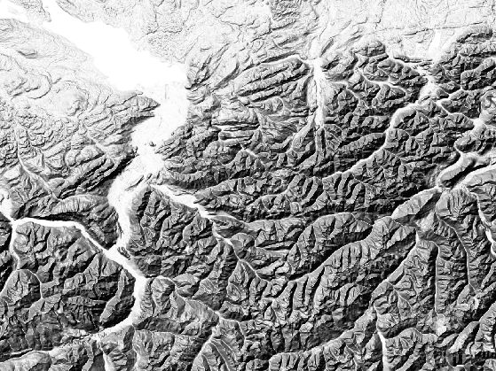
Our goal is for the the Trailguide map to become a great map for outdoor activities like mountain biking and hiking. Terrain formations and singletrails are the main areas of focus. The design should be clean with a balanced level of detail and overview for optimized readability.
Elements that are important for biking and hiking, like trails, peaks, contours and hillshades, fountains, and parkings are visible and the most important ones are emphasized.
Less important elements such as residential areas, highways, main roads, are toned down on the map. Unnecessary elements such as different kinds of land use, building names, and many points of interest not related to outdoor activities are not shown at all.
Finally, there should also be good visual separation of singletracks and wider gravel- and forestry roads.
The color scheme should lean towards warmer colors with reduced saturation and having no distractive patterns in the polygons representing the different land formations. At the same time, the color scheeme should fit the Trailguide app and allow for the interactive content overlays to have enough contrast for optimized visibility.
Often maps are developed for large screens on desktop computers and are therefore harder to read on small phones. The Trailguide map is optimized to be used on your phone. Elements like points, lines, and text have a pleasing and readable size, distance, and contrast.
With Trailguide, Google maps and others, using digital web maps became so natural for many people. But how does a digtial map service actually work?
The main core of it all is a database where all the raw data is saved. This includes all kinds of geospatial data such as points, lines, and polygons, along with their related attributes.
For example a road can be stored in the database as a curved line with attributes for the name and type of road. Another data source contains the definition for the visual styling of this element. For instance that roads of this type should be red, have a width of 10 pixels, and is visible from zoom level 10 through 18.
The raw map data and styling definitions are read by a program, called a renderer, which "paints" image of the map.
When you open Trailguide, a request for the current map section is sent to the map server, the renderer queries the database for raw data, mixes it with the styling information, and renders the final image that makes up the map section you asked for. A bit simplified but basically how it works.
How does the development process of a web map look like?
Well, everything was quite new to me, so I had to learn a lot of new things. After a bit of research I found out much of the software is open source and is used and developed for OpenStreetMap (OSM) and other open map projects.
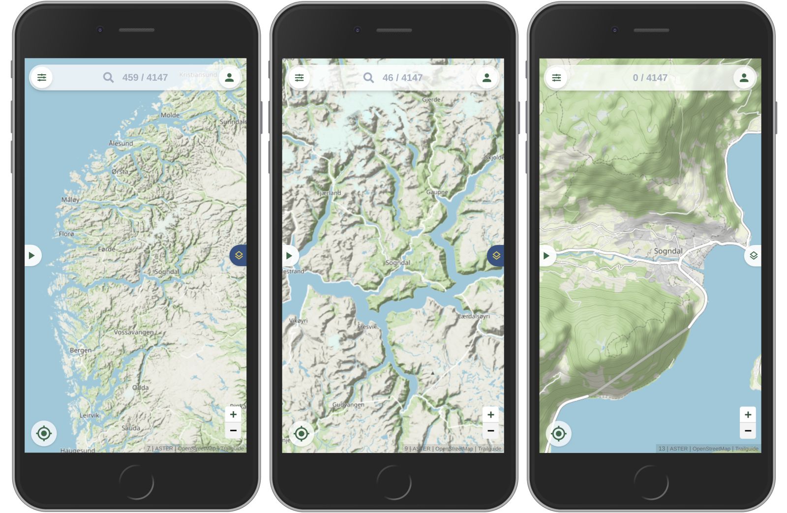
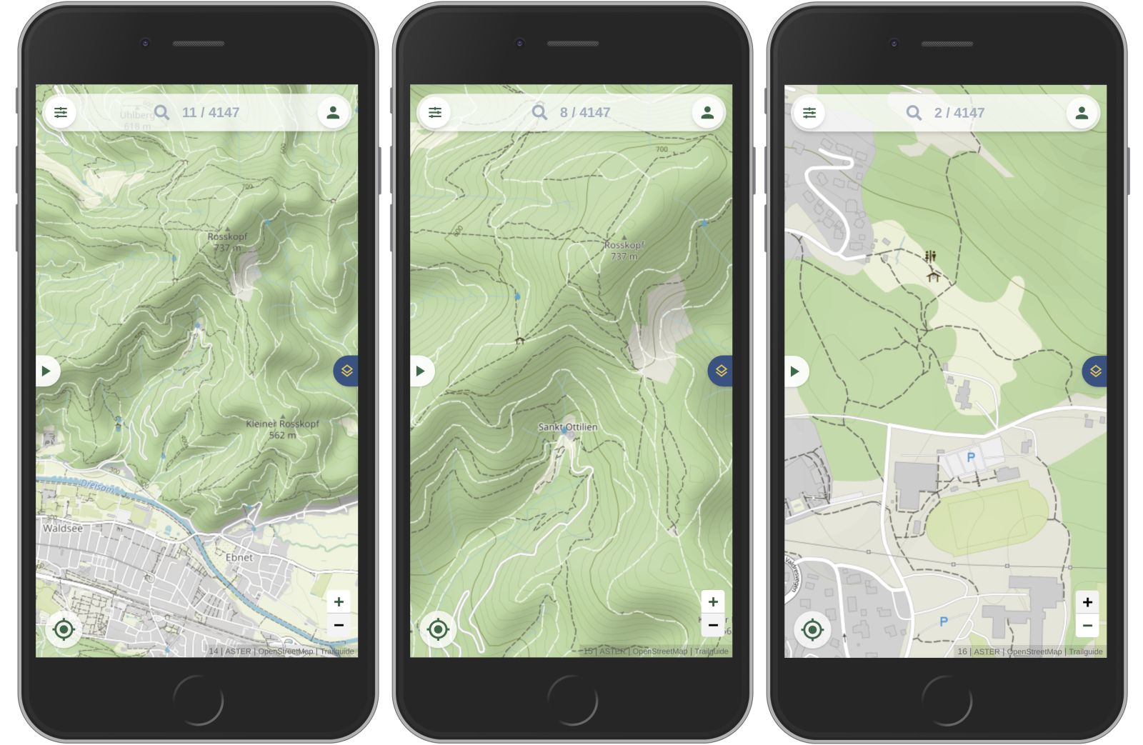
The first step was to set up the OSM toolchain and test the process of rendering a map on my local computer for a small test region of the alps.
When the tool chain worked locally, I set up a small test server in the cloud using the whole of Europe as my test region. At this point the main design process started. Deciding which elements should be visible on the map and how they should be represented. There are rules written in the code for everything you see on the map.
One of the more challenging tasks was to get hold of quality elevation data for the whole planet, to handle that big amount of data, and to process it to obtain the visual look and level of detail we wanted. Also a big part of the design process was testing the map.
A great test team provided valuable feedback and from the prototype to the currently published version I implemented 221 major changes.
Then I set up the cloud production server with data for the whole planet. The database with the raw OSM data, the contour lines and the hillshadings have around 2TB (1TB is 1.000GB, or a "a lot") for the whole planet.
With this kind of huge data sets, developing fast and efficient software for rendering the map becomes absolutely key. There were many steps of optimizing the speed and taking care of security until we were ready to publish the map.

Where does the map data come from?
The data elements on the map come from the OSM project (OpenStreetMap) with over 6 million contributors world wide. That makes it one of the best and most up-to-date map data sources.
The database is open and everyone can contribute! With the OpenStreetMap editor that is very easy and features can be added or edited in no time. Check out openstreetmap.org for more on this.
The elevation data comes from a joint venture of the American NASA and the Japanese METI. We use the very latest available dataset wich has very high quality. Most other maps use older data, which have abnormal spikes, voids and artefacts or have no data at all north or south of 60°.
The dataset we use covers northern and southern regions up to 83° latitude, so the map can be used even in northern Norway and Spitsbergen!